How to Use Color Psychology to Decorate Your Home
Color does more than just look pretty — it can influence your mood, energy levels, and overall well-being. That’s why understanding color psychology is such a powerful tool when decorating your home. Whether you want to feel calm in your bedroom, energized in your kitchen, or focused in your home office, the right color choices can help shape the atmosphere of every room.
What Is Color Psychology?
Color psychology is the study of how colors affect human behavior and emotions. It’s used in marketing, therapy, fashion, and yes — interior design. When applied to home decor, certain colors can:
- Promote calm or relaxation
- Encourage creativity or focus
- Stimulate appetite or conversation
- Reflect warmth or coolness
- Make a room feel bigger or cozier
Let’s explore what each color can bring to your space.
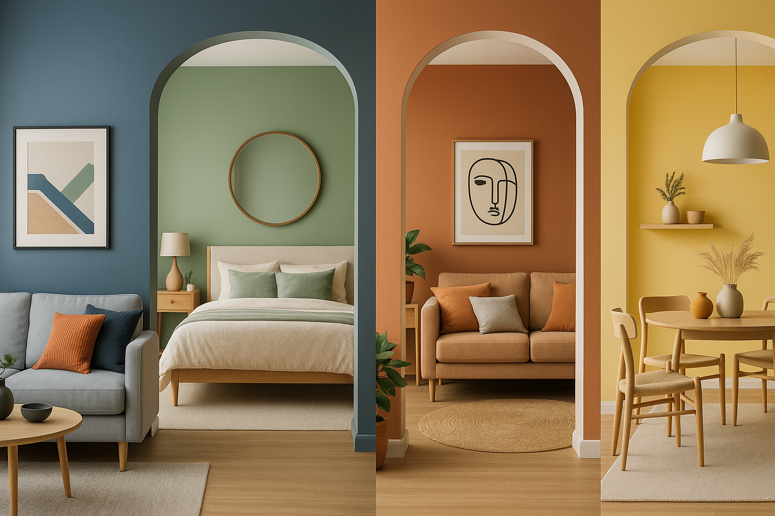
Blue: Calm, Trust, and Focus
Blue is one of the most popular colors in interior design for a reason — it promotes peace, clarity, and concentration. Use blue in:
- Bedrooms: Soft blues help you relax and sleep
- Bathrooms: Cool tones feel spa-like and clean
- Offices: Navy blues promote focus and professionalism
Avoid overly cold or dark blues in north-facing rooms, and balance them with warm wood or gold accents.
Green: Balance, Nature, and Renewal
Green represents harmony, freshness, and growth. It’s associated with nature and has a calming, grounding effect. Ideal for:
- Living rooms and lounges: Encourage relaxation and conversation
- Bedrooms: Olive or sage tones are especially soothing
- Kitchens: Green adds freshness and energy
Pair green with neutral tones or natural textures for a restful, organic feel.
Yellow: Optimism and Energy
Yellow is cheerful, bright, and known to stimulate the mind. However, it can be overpowering in large doses. Best used in:
- Kitchens: Inviting and energizing
- Dining rooms: Stimulates appetite and sociability
- Entryways: Gives a welcoming, sunny vibe
Stick to soft buttery yellows for calm, or bolder mustard shades for a modern pop.
Red: Passion and Warmth
Red is bold, intense, and attention-grabbing. It stimulates energy and can raise heart rate — which makes it perfect for spaces with action and interaction.
- Dining rooms: Enhances appetite and encourages conversation
- Living rooms: Adds drama and warmth when used in moderation
- Accent walls: A great place for deep reds like burgundy or terracotta
Too much red can be overwhelming, so balance it with neutrals or earth tones.
Orange: Creativity and Warmth
Orange is playful, warm, and creative — but it’s also polarizing. For those who love it, orange can bring vibrancy and friendliness to a room. Try:
- Home offices or studios: Sparks creativity
- Kitchens or breakfast nooks: Promotes energy and positivity
- Playrooms: Fun and uplifting
Use orange as an accent rather than a dominant color unless you’re aiming for a bold statement.
Purple: Luxury and Creativity
Historically associated with royalty, purple evokes elegance, richness, and imagination. Different shades carry different moods:
- Lavender: Light, calming — great for bedrooms or bathrooms
- Deep plum or eggplant: Rich and dramatic — ideal for accent walls
- Muted mauve: Soft and romantic for living or dining areas
Pair purples with metallics or velvets to enhance their luxurious feel.
Pink: Comfort and Positivity
Pink ranges from playful to sophisticated. It’s no longer just for nurseries — it’s found its way into every part of the home:
- Blush tones: Soft and calming — great for bedrooms and living rooms
- Coral or rose: Energetic and romantic
- Muted pinks: Pair beautifully with earthy tones for a modern twist
Avoid overly saturated pinks unless you’re going for a pop-art or glam effect.
Black: Sophistication and Depth
Black is elegant, bold, and grounding. It adds instant drama and contrast. Use black to:
- Frame a space (like window trims or interior doors)
- Highlight architectural features
- Balance out bright or pastel palettes
- Add depth to small spaces or nooks
Use black sparingly to avoid making the room feel heavy or closed-in.
White: Cleanliness and Simplicity
White is timeless and flexible. It reflects light and helps make spaces feel larger. Great for:
- Walls in small or dark rooms
- Scandinavian or minimalist styles
- Layering textures and materials
Use warm whites to avoid sterile vibes, and combine with color or wood to add warmth.
Gray: Calm and Versatility
Gray is the ultimate neutral — it works with almost any style. Light gray is calming and elegant, while dark gray is dramatic and cozy. Ideal for:
- Living rooms and bedrooms: Especially when paired with blush, navy, or white
- Offices and bathrooms: Clean, quiet, and modern
- Hallways: Subtle yet sophisticated
Warm grays work better in rooms with cool light, while cool grays balance warm tones.
Final Tips for Using Color Psychology
- Use accent colors in decor, pillows, rugs, or artwork if you’re not ready to commit to bold walls
- Consider the room’s lighting — natural light enhances warm colors; artificial light may cool them down
- Don’t forget about undertones — for example, beige can skew pink, yellow, or gray
- Test paint swatches at different times of day before choosing
Final Thought: Let Color Work for You
Color isn’t just about what looks good — it’s about how you feel in your space. By applying the principles of color psychology, you can intentionally design rooms that lift your mood, help you rest, energize your mornings, or fuel your creativity.
Let your walls, furniture, and accessories support the lifestyle you want — all through the power of color.