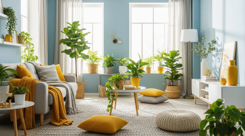
How to Use Color Psychology in Home Decor
Color isn’t just visual—it’s emotional. The colors you choose for your home can influence your mood, energy levels, focus, and even your sense of peace. By understanding color psychology, you can design a home that not only looks beautiful but also feels right for your lifestyle and personality.
What Is Color Psychology?
Color psychology is the study of how colors affect human behavior and emotions. Each hue has its own psychological effect, which can vary depending on culture, context, and individual preferences.
In home decor, you can use color psychology to:
- Create a calming or energizing atmosphere
- Set the tone for each room’s purpose
- Express your personal style
- Improve your daily well-being
Key Color Meanings and How to Use Them
1. Blue – Calm, Focus, Stability
- Best for: Bedrooms, bathrooms, offices
- Effect: Lowers stress, promotes relaxation and concentration
- Tips: Light blues feel airy; navy adds sophistication
2. Green – Balance, Freshness, Renewal
- Best for: Living rooms, kitchens, home offices
- Effect: Represents nature and harmony; easy on the eyes
- Tips: Sage and olive greens feel earthy; emerald adds luxury
3. Yellow – Energy, Warmth, Optimism
- Best for: Kitchens, dining rooms, playrooms
- Effect: Uplifts mood, stimulates creativity
- Tips: Use softer yellows for comfort; brights can be overwhelming in large doses
4. Red – Passion, Power, Excitement
- Best for: Dining rooms, entryways, accent walls
- Effect: Boosts energy and conversation; raises heart rate
- Tips: Use sparingly or as accents to avoid overstimulation
5. Orange – Fun, Enthusiasm, Social Energy
- Best for: Workout rooms, play areas, casual living spaces
- Effect: Encourages activity and conversation
- Tips: Terracotta tones feel more grounded and modern
6. Purple – Creativity, Luxury, Spirituality
- Best for: Bedrooms, meditation spaces, reading nooks
- Effect: Stimulates imagination; darker purples feel rich and dramatic
- Tips: Lavender is calming; plum or eggplant adds depth
7. Pink – Comfort, Romance, Gentleness
- Best for: Bedrooms, nurseries, cozy corners
- Effect: Nurturing and affectionate
- Tips: Blush tones feel modern and soothing; bright pinks are playful
8. White – Purity, Simplicity, Freshness
- Best for: Any room; ideal for small or dark spaces
- Effect: Creates a sense of cleanliness and openness
- Tips: Mix textures to avoid a sterile look
9. Gray – Sophistication, Calm, Neutrality
- Best for: Living rooms, offices, bedrooms
- Effect: Grounding and elegant when used well
- Tips: Pair warm grays with cozy textiles to soften the feel
10. Black – Drama, Elegance, Power
- Best for: Accent walls, powder rooms, modern kitchens
- Effect: Adds contrast and modern edge
- Tips: Use in moderation to avoid making rooms feel small
How to Build a Color Palette for Your Home
Step 1: Choose a Base Color
This should be your main neutral or go-to shade for walls, large furniture, or flooring. Common choices:
- White or off-white
- Soft gray
- Warm beige
Step 2: Add Secondary Colors
These should support your base and appear in medium-size elements like curtains, rugs, or bedding.
- Pick 1–2 that complement or contrast your base.
Step 3: Use Accent Colors
These appear in pillows, decor items, art, or flowers. They bring energy and personality.
- Go bold here if you like!
Example Palette:
- Base: Soft gray
- Secondary: Navy blue and white
- Accent: Mustard yellow
Room-by-Room Color Psychology Tips
Bedroom
- Use calming tones like blue, green, or lavender
- Avoid intense reds or bright yellows
- Add warmth with wood tones or soft neutrals
Living Room
- Choose warm neutrals or light greens for comfort
- Add pops of color with pillows or art
- Consider using a bold accent wall for personality
Kitchen
- Yellow or soft green enhances appetite and energy
- White kitchens feel fresh and clean
- Avoid dark tones if space is small or lacks natural light
Bathroom
- Light blues and whites evoke spa-like serenity
- Avoid overly vibrant colors in small bathrooms
- Use gold or black accents for a modern touch
Office
- Blue improves concentration
- Green eases eye strain
- Avoid overstimulating colors like red or orange
Final Thought: Design with Emotion in Mind
Decorating with color psychology allows you to create spaces that feel right—not just look pretty. Whether you want a peaceful retreat, a productive workspace, or an energizing kitchen, let color be your secret design tool for shaping emotion, experience, and lifestyle.
