How to Choose the Right Color Palette for Your Living Room
Choosing the perfect color palette for your living room is one of the most powerful ways to transform the space. The right colors not only set the mood and tone but also reflect your personal style and make the room more inviting. Whether you’re going for cozy and warm, bright and airy, or bold and dramatic, this guide will help you select colors that work harmoniously together.
Why Color Matters in Interior Design
Color affects how we feel in a space. It can make a room feel larger or smaller, warmer or cooler, energetic or relaxing. In the living room — a space often used for both relaxation and entertaining — finding the right balance is key.
Colors also interact with natural and artificial lighting, so the same color can look different at various times of the day. That’s why choosing the right palette involves more than just picking a favorite shade.
Start with a Base Color
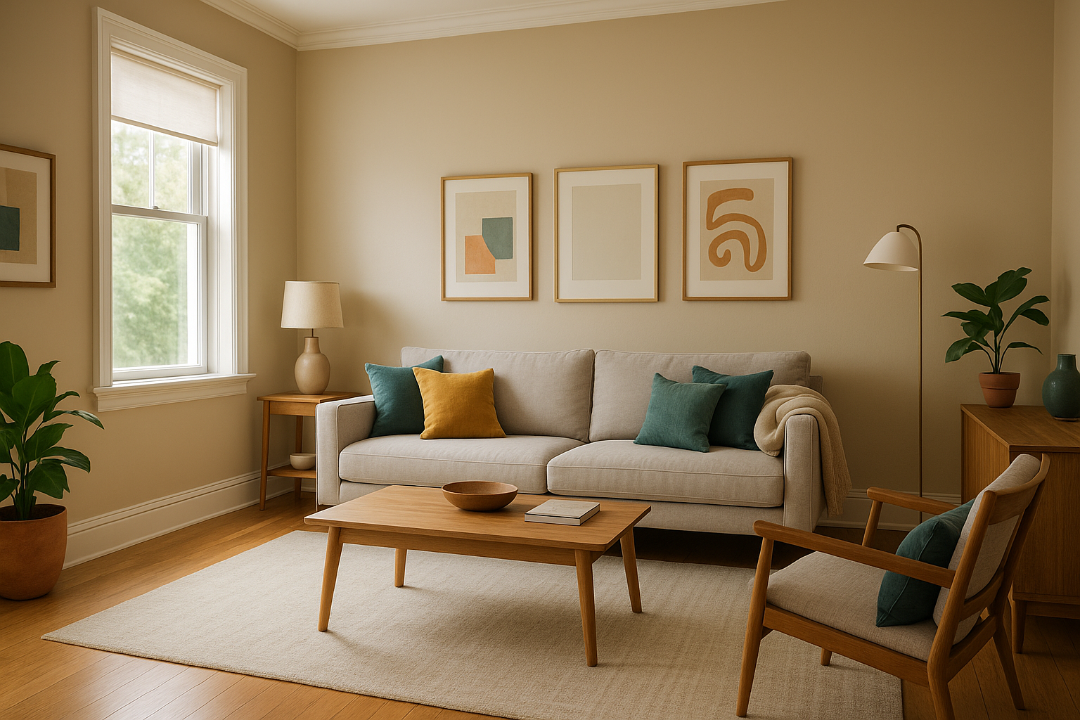
The base color is the foundation of your palette — it will cover the largest surface areas, such as walls, large rugs, or a sofa. Choose a neutral or light tone for flexibility and a timeless feel. Popular base colors include:
- White or off-white
- Light gray
- Beige or taupe
- Soft greige (a mix of gray and beige)
These tones create a clean backdrop and make it easier to layer in accent colors through furniture, pillows, and decor.
Identify a Secondary Color
The secondary color supports the base and brings more personality to the room. It can show up in curtains, accent chairs, or artwork. Choose a shade that complements the base but adds a bit of contrast. For example:
- Pair a warm beige base with olive green or terracotta
- Match a gray base with navy blue or soft blush
- Complement off-white with muted teal or rust tones
Try to stay within the same temperature family — either warm (reds, oranges, yellows) or cool (blues, greens, purples) — for a cohesive look.
Add an Accent Color
Accent colors are where you can be bold and creative. These are used in smaller doses to energize the space and make it feel dynamic. Ideal for pillows, vases, artwork, or even a single feature wall, accent colors can be:
- Deep jewel tones like emerald green or sapphire
- Metallics like gold, brass, or copper
- Brights like mustard yellow, coral, or navy blue
Use accents sparingly — too many can make the room feel chaotic. The goal is balance.
Consider the Room’s Lighting
Natural light plays a big role in how colors appear. A room with lots of sunlight can handle darker tones, while a dimly lit room may benefit from lighter shades. Here’s a quick guide:
- South-facing rooms: Get warm light — most colors look good here.
- North-facing rooms: Cooler light — warm colors help counterbalance this.
- East-facing rooms: Bright in the morning — work well with soft warm tones.
- West-facing rooms: Golden light in the afternoon — can enhance rich colors.
Test paint samples on multiple walls and observe them at different times of day before committing.
Use the 60-30-10 Rule
A classic design principle, the 60-30-10 rule helps guide color distribution:
- 60% of the room is your base color (walls, rugs, large furniture)
- 30% is your secondary color (curtains, chairs, wood tones)
- 10% is your accent color (pillows, art, vases, small accessories)
This ratio creates visual harmony and prevents any one color from dominating the space.
Think About Mood and Function
Color can influence the atmosphere of your living room, so think about the mood you want to set:
- Relaxing and tranquil: Use cool shades like light blue, lavender, or sage
- Warm and inviting: Try terracotta, caramel, or deep gold
- Modern and clean: Go for black, white, and gray combinations
- Energetic and creative: Use bold colors like mustard, teal, or fuchsia
Match the palette to how you want people to feel in the space — and how you want to feel when you’re there.
Don’t Forget the Ceiling and Trim
Often overlooked, ceilings and trim can add subtle contrast or contribute to the overall color scheme. Some ideas:
- Paint the ceiling a lighter version of your wall color for a soft transition
- Use crisp white trim to frame the walls and give a clean look
- Try colored trim (like charcoal gray or soft sage) for something more dramatic
These small details can elevate the entire room’s design.
Create Flow with Adjacent Spaces
If your living room connects to other rooms, consider how the colors interact. Use a similar palette or complementary tones to create flow throughout your home. You don’t need every room to match — but they should feel like they belong together.
Soft transitions between colors in adjacent rooms help your home feel more cohesive and professionally designed.
Use Tools and Samples
To make things easier, use color tools and samples:
- Paint swatches from home improvement stores
- Digital color palette generators (like Coolors or Adobe Color)
- Sample boards you can move around the room
- Mood boards with fabrics, photos, and finishes
Always test your top choices with physical samples before making final decisions.
Final Touches: Bring the Palette to Life
Once you’ve chosen your palette, bring it to life with thoughtful decor. Add pillows, throws, candles, artwork, and books in your chosen shades. Layer textures to add depth and use natural elements like plants to connect everything together.
Your color palette is more than just paint — it’s the emotional backbone of the room. Done right, it transforms your living room into a place where you love to spend time.