How to Mix Patterns and Textures Like a Pro
Mixing patterns and textures can transform a flat, boring room into a layered, dynamic, and professionally styled space. While it might seem intimidating at first, understanding a few simple rules will give you the confidence to mix prints and textures like an interior designer.
Why Mix Patterns and Textures?
- Adds Depth and Dimension: Layering creates a sense of richness.
- Introduces Personality: Patterns reflect your style and energy.
- Balances Visual Weight: Textures help soften bold patterns or colors.
- Creates a Curated Look: It feels intentional and designer-level.
Step 1: Start with a Color Palette
Before mixing any prints or materials, define your color scheme. This creates unity even among contrasting elements.
- Choose 2–3 main colors and 1–2 accent colors.
- Use a consistent undertone (warm or cool) throughout.
- Stick with a dominant neutral to avoid overwhelming the room.
Example: Navy blue, ivory, and mustard with touches of rust.
Step 2: Anchor with a Base Pattern
Start with one bold or large-scale pattern that sets the tone—this is often found on a rug, statement wallpaper, or drapes.
- Choose something graphic or eye-catching.
- This is your “anchor” pattern that everything else will play off.
Step 3: Layer in Secondary Patterns
Add complementary patterns that are smaller in scale or simpler in design.
- Use stripes, dots, checks, or geometrics.
- Keep them in the same color family as the anchor.
- Vary the scale: if your first pattern is large, keep the second medium or small.
Example: A large floral rug paired with striped throw pillows.
Step 4: Introduce Texture for Balance
Texture is the secret weapon of sophisticated design. It adds warmth and subtle contrast, even in monochrome rooms.
Popular texture choices:
- Textiles: Linen, velvet, boucle, wool
- Natural materials: Wood, rattan, leather
- Metal finishes: Brushed brass, matte black
- Stone and ceramics: Add organic, tactile appeal
Tip: Use texture to calm down a space that has a lot of pattern. A chunky knit throw or woven basket brings softness and order.
Step 5: Stick to the Rule of Three
Limit yourself to three main patterns per room to avoid chaos:
- One bold
- One geometric or structured
- One subtle or textural (like a tone-on-tone pattern)
This formula keeps things interesting but still cohesive.
Step 6: Play with Pattern Placement
Distribute patterns throughout the room instead of clustering them all in one spot.
- Balance a bold wallpaper with simpler patterned cushions.
- Use the same color in different prints (e.g., navy stripes on curtains and navy polka dots on a pillow).
- Echo textures across the space for rhythm (e.g., woven baskets and rattan chairs).
Tips for Common Room Types
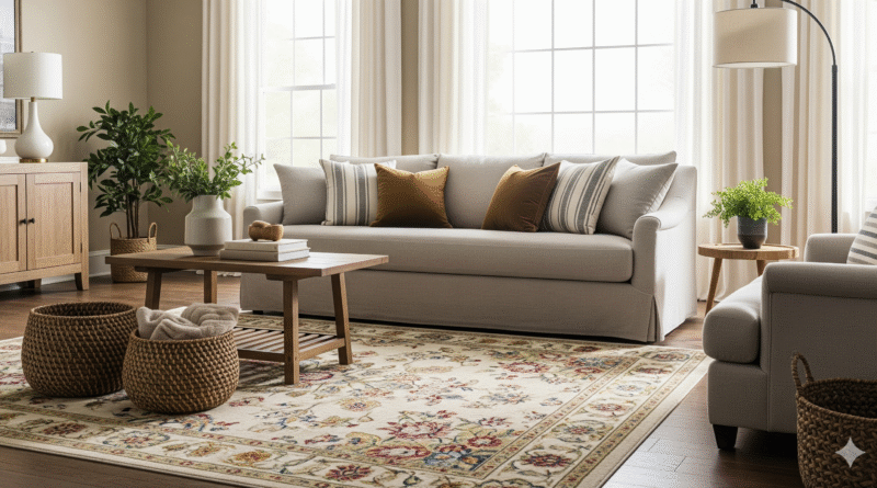
Living Room
- Large rug with pattern
- Patterned cushions with different scales
- Soft, textured throw on a leather sofa
- Linen curtains to balance everything
Bedroom
- Patterned duvet cover
- Subtler pattern on throw pillows
- Velvet bench or headboard
- Natural fiber rug underfoot
Dining Room
- Patterned runner or placemats
- Textured dining chairs (leather, wood, or upholstered)
- Ceramic centerpiece bowl
- Woven pendant light overhead
Office
- Patterned area rug
- Abstract or graphic wall art
- Smooth desk with textured accessories (stone pen holder, cork board)
Patterns that Work Well Together
- Florals + stripes
- Plaid + polka dots
- Animal print + solids
- Geometric + abstract
- Tone-on-tone patterns layered with bolder designs
Common Mistakes to Avoid
- Too Many Patterns: Stick to three at most.
- Clashing Colors: Always start with a defined palette.
- Same Scale Everywhere: Mix large, medium, and small prints.
- Neglecting Texture: It’s just as important as pattern.
Final Thought: Confidence is Key
Mixing patterns and textures is less about strict rules and more about confident, intentional layering. When colors align, scales vary, and textures are balanced, you’ll achieve a room that feels rich, inviting, and full of personality—just like a pro designed it.