How to Use Color Psychology in Interior Design
Colors do more than just make a room look beautiful—they also affect how we feel and behave. By understanding the basics of color psychology, you can use colors strategically to create moods and improve the functionality of each space in your home.
What Is Color Psychology?
Color psychology is the study of how colors influence human emotions and behavior. Different hues can evoke calm, energy, happiness, or even focus. In interior design, this knowledge allows you to intentionally design spaces that support your lifestyle and well-being.
The Emotional Impact of Common Colors
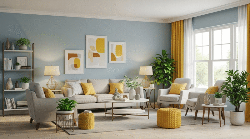
Blue – Calm and Focus
- Ideal for: Bedrooms, bathrooms, home offices
- Effect: Lowers stress levels, encourages relaxation and concentration
- Best shades: Soft sky blues, navy, muted teal
Green – Balance and Renewal
- Ideal for: Living rooms, home offices, kitchens
- Effect: Promotes harmony, focus, and a connection to nature
- Best shades: Sage, olive, emerald
Yellow – Energy and Optimism
- Ideal for: Kitchens, entryways, creative studios
- Effect: Inspires cheerfulness and energy
- Best shades: Soft butter, sunflower yellow, golden mustard
Red – Passion and Warmth
- Ideal for: Dining rooms, kitchens, accent walls
- Effect: Stimulates appetite and conversation
- Best shades: Brick red, wine, terracotta
Orange – Enthusiasm and Warmth
- Ideal for: Workout spaces, playrooms, social areas
- Effect: Boosts energy and sociability
- Best shades: Burnt orange, coral, peach
Purple – Creativity and Luxury
- Ideal for: Bedrooms, meditation spaces, powder rooms
- Effect: Inspires creativity and gives a sense of elegance
- Best shades: Lavender, deep plum, mauve
Pink – Tranquility and Warmth
- Ideal for: Bedrooms, nurseries, bathrooms
- Effect: Creates a sense of comfort and nurturing
- Best shades: Blush, dusty rose, salmon
White – Purity and Spaciousness
- Ideal for: Any room, especially small or dark areas
- Effect: Enhances light, gives a clean and open feel
- Best uses: Pair with other colors for balance
Gray – Sophistication and Calm
- Ideal for: Living rooms, offices, hallways
- Effect: Adds elegance and neutrality
- Best shades: Warm greige, cool gray, charcoal
Black – Power and Drama
- Ideal for: Accent walls, bathrooms, modern kitchens
- Effect: Adds depth, luxury, and visual impact
- Use with caution: Best in small doses or paired with light colors
How to Apply Color Psychology at Home
1. Define the Purpose of Each Room
Before choosing a color, think about what activities take place there. Is it for relaxing, working, or entertaining? Let the function guide the color palette.
2. Choose a Dominant and Supporting Palette
Select a main color based on the emotional tone you want to create. Then, layer in complementary or contrasting tones to add complexity.
3. Test Paint Samples in Natural Light
Colors look different under various lighting conditions. Always test swatches on different walls and observe throughout the day.
4. Use Neutrals as Anchors
Neutral shades like white, beige, and gray are essential for balancing brighter or bolder colors. They help maintain visual calmness.
5. Don’t Forget the Ceiling and Floor
Painted ceilings or colorful rugs can influence a room’s atmosphere just as much as the walls.
Using Color Psychology in Specific Rooms
Living Room
- Goal: Comfort and conversation
- Try: Warm neutrals, sage green, soft blue, or terracotta accents
Bedroom
- Goal: Relaxation and rest
- Try: Pale blue, lavender, or blush with white trim
Kitchen
- Goal: Energy and social connection
- Try: Yellow, red accents, or green cabinets for freshness
Home Office
- Goal: Focus and creativity
- Try: Cool blues, greens, or subtle pops of purple
Bathroom
- Goal: Serenity and cleanliness
- Try: Light gray, white, soft green, or light aqua
Avoiding Common Mistakes
- Using too many bold colors: Stick to one or two standout tones to avoid overwhelm.
- Forgetting lighting: Artificial lighting can change how colors appear.
- Ignoring flow: Make sure colors transition smoothly between rooms, especially in open floor plans.
Final Thought: Design That Feels Good
When used thoughtfully, color becomes more than just decoration—it becomes a powerful design tool. By applying color psychology to your home, you can create an environment that supports your emotions, enhances your routines, and brings joy to your everyday life.